Below, is a picture of the Nike trainer.
Monday, 19 September 2016
Sample 10: My design piece (Observational drawing)
Planning process
Below, is a picture of the Nike trainer.
Final picture
Below, is a picture of the Nike trainer.
Sample 9: My design sample (New hunger games poster)
Planning process
Below, is a picture of my thought process.

Below, is a picture of my thought process.

Final process
The best part about my piece is the swirl and the birds. I was able to use my initiative to create a new poster which represents the hunger games. Also, by using the main element that surrounds the movie, e.g. the mocking jay i was able to use this idea to create an exciting piece.
Sample 8: My design work (Logo)
Planning behind the logo
This design is a replacement sign/logo to encourage children to play outdoors. The picture below shows my thought process.

Final process

What i like most about my piece is the text and by using this typeface i am able to attract the attention of children. Also, i like the images, as it appeals more to children too.
This design is a replacement sign/logo to encourage children to play outdoors. The picture below shows my thought process.

Final process

Friday, 16 September 2016
Sample 7: Leonardo Da Vinci's , Mona Lisa painting
The Mona Lisa painting, was created by Leonardo Da Vinci. The painting is famous all over the world, and it is a good example of portrait art. The real painting is located in Paris at the Louvre Museum.
This is an image of Lisa Gherardini as she sits in a chair behind a spectacular scenery. It is believed that Leonardo Da Vinci hired a group of musicians, to play music for Lisa to keep her amused; which shows in her smile.
Finished painting
The final painting was done using oil pastels and Leonardo made sure that he got every detail of her face and body right. The technique involves creating a smooth transition between colours, which is seen in her face through the soft contouring of her eyes and nose. The Mona Lisa painting was not signed or dated, but it was believed to be created around the year 1503/1504.
What i find compelling is the technique Leonardo used using oil pastels and he was able to clearly define Lisa's face, making the appearance look soft and not too harsh.
Monday, 12 September 2016
Sample 6: Andy Warhol's 32 Campbell's Soup Cans
In 1962, Andy Warhol created the famous painting "32 Campbell's Soup Cans", which was his favourite work.
Planning process
Photograph
Firstly, Andy took a picture of a soup can and traced it onto a canvas. His inspiration came from his friend and he suggested that he should use an everyday object for his piece. Also, he based his painting on the artistic movement of Pop Art which was introduced during the 1950's.
The soup can painting


The final piece

Andy received a return studio visit from the director Irving Blum of the Ferus Gallery in LA. He was expecting Andy to bring paintings of comic strips, but Irving was shocked to see the painting of the can. The gallery was so impressed with his work, that they immediately offered him a chance for his work to be exhibited in a show. Andy decided to create more of the soup cans. This time, they ranged from thirty two varieties of Campbell's soups.
What i find interesting about this piece, is the way you can get inspiration from anything and still create a good work of art.
Planning process
Photograph
Firstly, Andy took a picture of a soup can and traced it onto a canvas. His inspiration came from his friend and he suggested that he should use an everyday object for his piece. Also, he based his painting on the artistic movement of Pop Art which was introduced during the 1950's.
The soup can painting


The final piece

Andy received a return studio visit from the director Irving Blum of the Ferus Gallery in LA. He was expecting Andy to bring paintings of comic strips, but Irving was shocked to see the painting of the can. The gallery was so impressed with his work, that they immediately offered him a chance for his work to be exhibited in a show. Andy decided to create more of the soup cans. This time, they ranged from thirty two varieties of Campbell's soups.
What i find interesting about this piece, is the way you can get inspiration from anything and still create a good work of art.
Sample 5: Jock Kinnear and Margaret Calvert's road signs
Design stage

These lowercase letters are from the original artwork, and they were placed in a tiling system in 1957 to 1964. The typeface is transport. The transport font is widely used on road signs today.
The Road Research Laboratory, carried out a readability test in 1959. They did this, to see if the signs were easy to read or not.
Today's road signs


What i find interesting about the road signs is the simplicity. Also, what i found compelling is that Jock and Margaret found ways, of making the road signs less distracting; by making the images more informative to the drivers.

These lowercase letters are from the original artwork, and they were placed in a tiling system in 1957 to 1964. The typeface is transport. The transport font is widely used on road signs today.
The Road Research Laboratory, carried out a readability test in 1959. They did this, to see if the signs were easy to read or not.
Today's road signs


Monday, 5 September 2016
Sample 4: My design work (Flower painting)
Sample 3: My design work (Gregg's new logo)
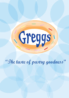
The picture below shows my thought process.
Final process
What I like most about my design, is the way all the colours and font styles came together.
Subscribe to:
Posts (Atom)


